I designed how travelers pick a hotel and pay
Expedia Group, Lodging, Checkout, Landing Pages
$7.8M + $5M
$7.8M from the lodging app redesign. $5M from checkout optimization.
This is the path where Expedia earns. Usually as the solo designer, I designed the lodging card, the property page and the checkout flow with its travel insurance add-on, and led a lodging design system that 500+ designers start from. I was also a major contributor to the homepage redesign.
- My role
- Designer, usually the solo designer on each team
- What I owned
- Lodging card and property page, the lodging app redesign, checkout flow and insurance add-on, both design systems
- Worked with
- PMs and engineers on Lodging, Checkout and Landing Pages
- Platforms
- iOS, Android, mobile web and desktop
One decision, made across three teams
Discovery and plan1 of 6
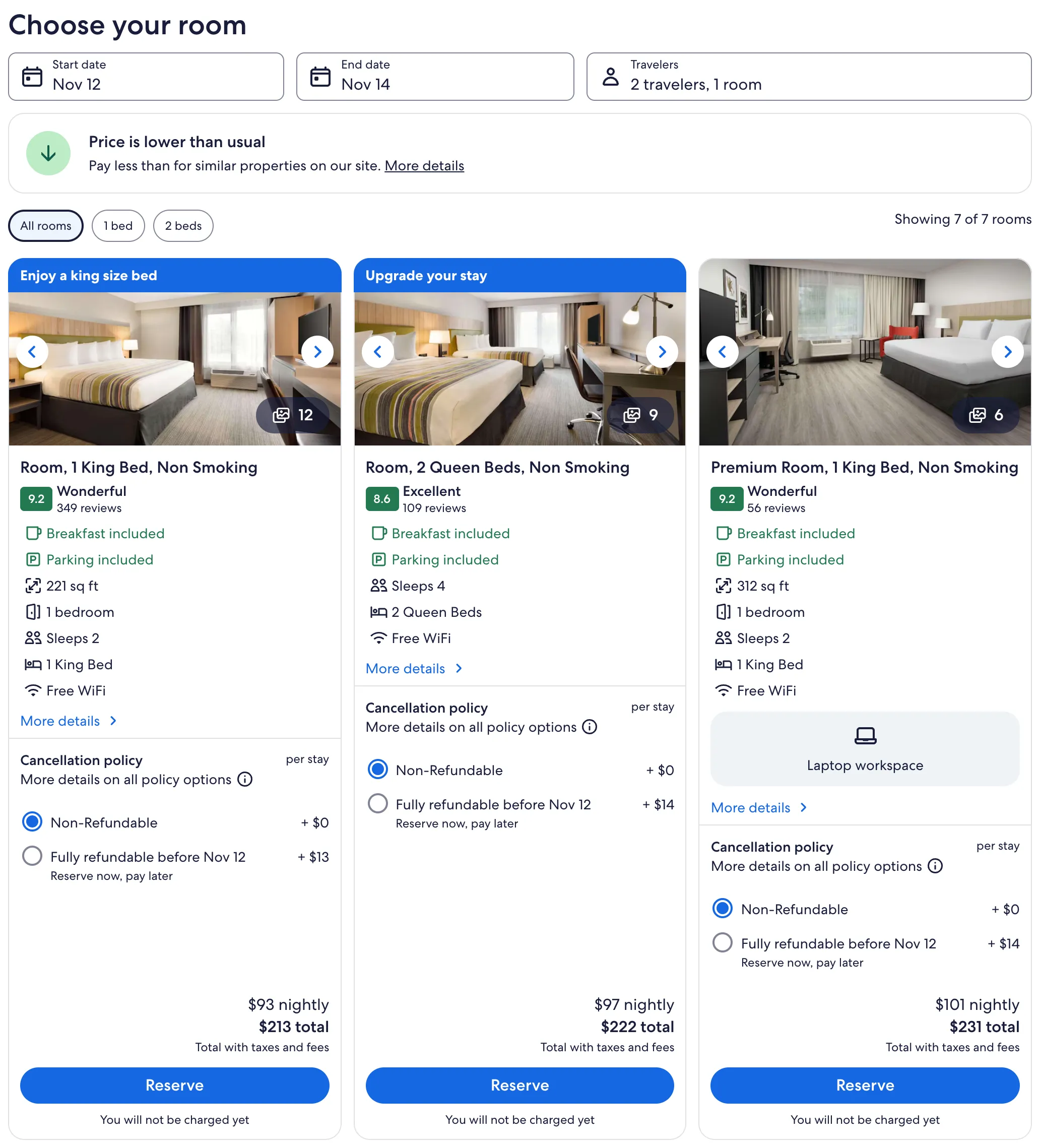
A traveler compares hotels on a card, decides on the property page, then pays in checkout. Each step belonged to a different team. I walked the whole path on every platform and looked at where travelers hesitated.
The insightTravelers make one decision across three teams. The path has to feel like one product, with the same patterns from the first card to the last tap.
So my plan had two parts. One source of truth for lodging, so every lodging designer starts from the same parts. And checkout improved in place, step by step, so the business sees gains every quarter.
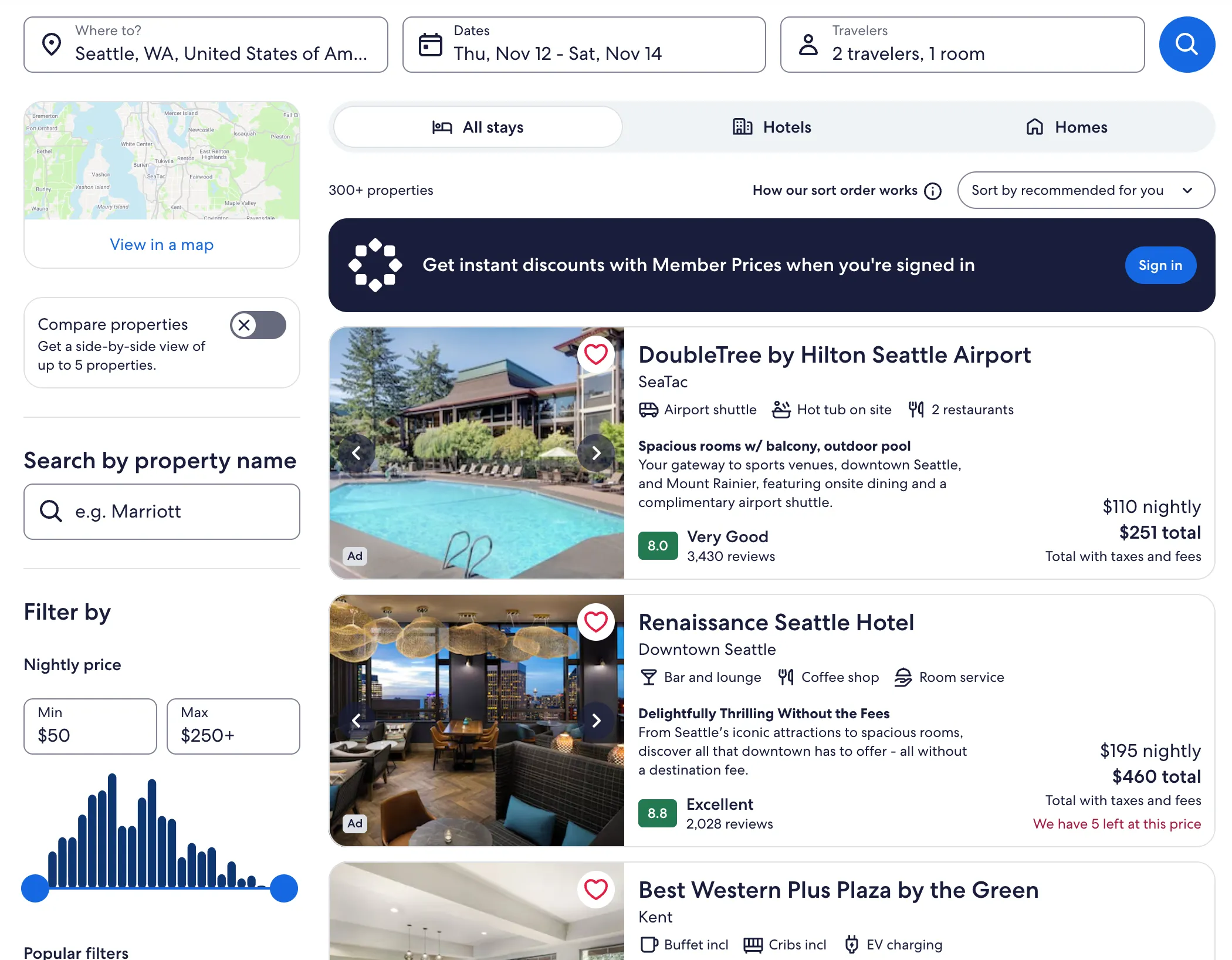
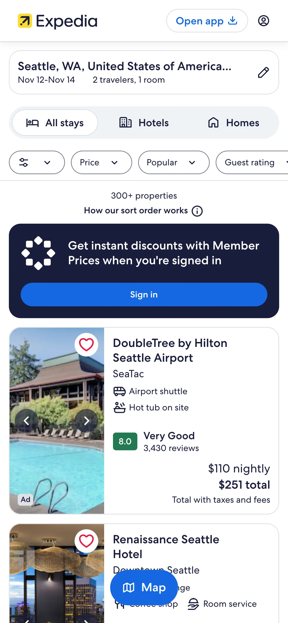
5+ app concepts, and only shippable ones survived
Lodging, explored in Figma2 of 6
I designed the lodging card travelers scan in search results, and the property page they land on when they tap one.
For the lodging native apps I explored and prototyped 5+ concepts: micro-interactions, a splash animation, video, a 360° view and motion graphics. I cut every idea engineers could not ship, so each concept was a real deliverable. I also led a new lodging design system, the single source of truth that 500+ designers now start from.
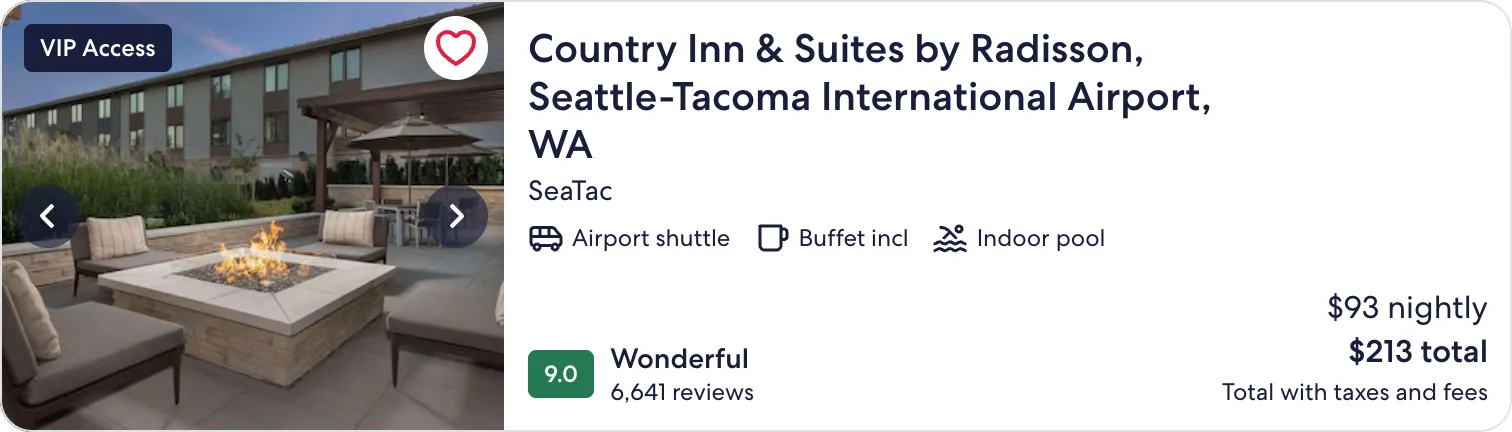
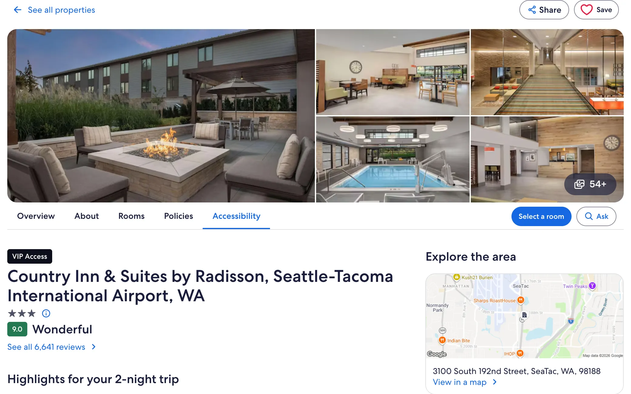
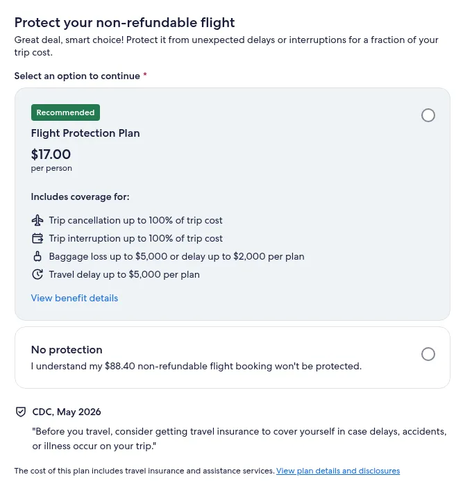
I designed the travel insurance add-on in checkout
Checkout3 of 6
I designed the checkout flow, including the travel insurance add-on. I built the checkout design system, and I contributed to the hybrid of legacy and new checkout pages that let the team improve the flow step by step without waiting on a rewrite.
The add-on is a clear choice at the moment of payment: protect the trip, or go without it. The image shows how it appears in Expedia checkout today.
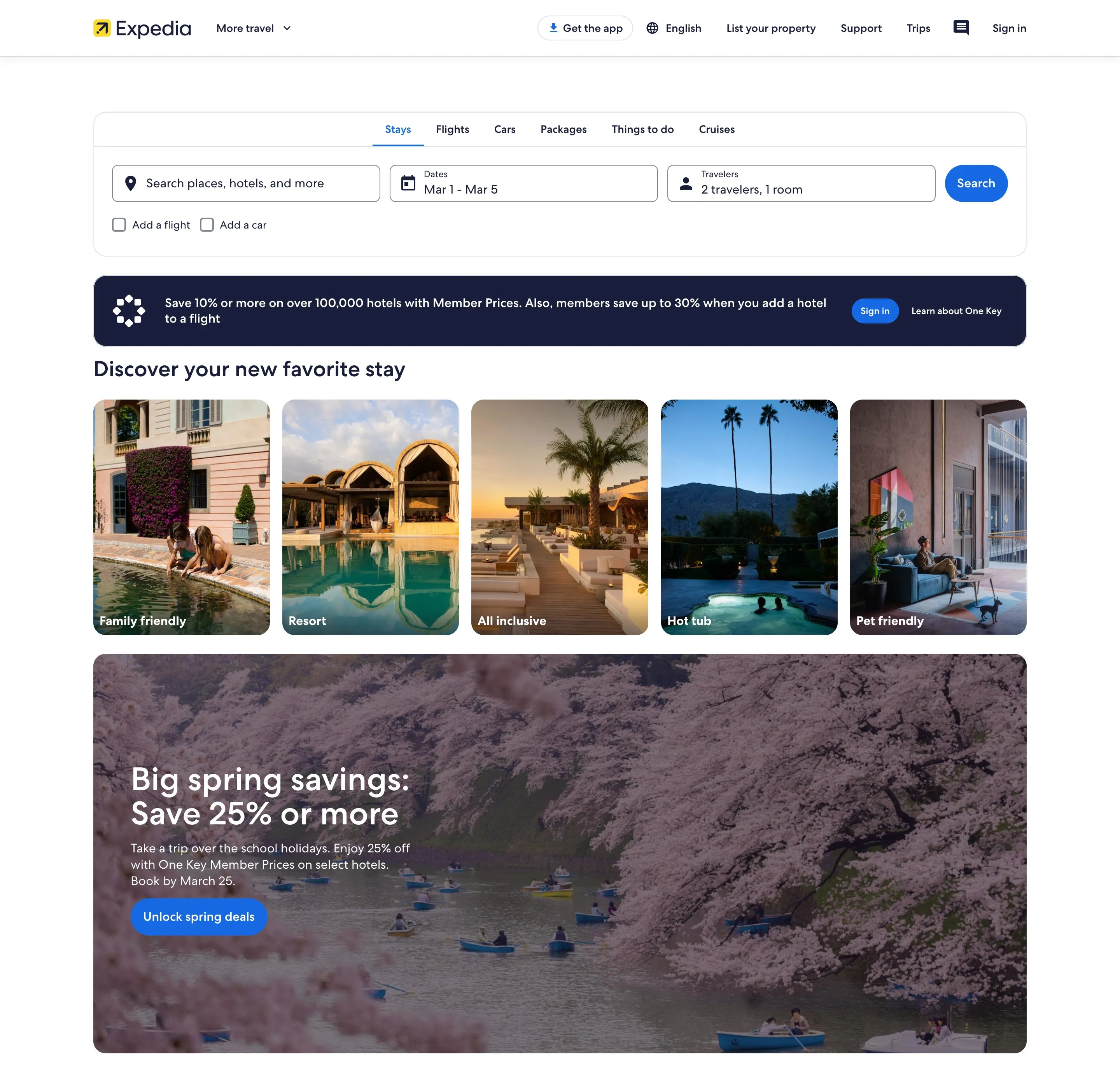
A major contributor to the homepage redesign
Landing Pages4 of 6
I was a major contributor to the Expedia homepage redesign, and it shipped. With PMs and engineers, I also re-architected landing pages across every line of business, one round at a time, aiming at engagement, click-through and conversion. Expedia has since moved to a newer homepage.
Decisions I made
-
Improve checkout in place
New checkout pages went live next to the legacy ones, under one checkout design system.
Why. The business needed gains every quarter. A full rewrite would have paused them.
Trade-off. Two generations of pages had to look and behave as one for a while.
-
One source of truth for lodging
I built one lodging design system that every lodging designer starts from.
Why. Consistency from search to booking only holds when every designer uses the same parts.
Trade-off. It took time up front, before any screen improved.
-
Prototype motion, keep it buildable
Every app concept had to be something engineers could ship.
Why. A concept that cannot ship never reaches a traveler.
Trade-off. I left out the wildest ideas.
$7.8M from lodging, $5M from checkout
Shipping and outcome5 of 6
I worked directly with the PMs and engineers on each team, through launch. The redesigned lodging apps raised conversion about 2.2%, worth $7.8M, and improved engagement and accessibility. Checkout optimization brought in $5M in revenue and beat the quarterly BPS targets two quarters in a row.
- The lodging card in search results, and the property page experience.
- The redesigned lodging apps on iOS, Android and mobile web.
- One lodging design system, the source of truth for 500+ designers.
- The checkout flow with the travel insurance add-on, and the checkout design system.
- The Expedia homepage redesign, as a major contributor.
One scorecard for the whole path
What’s next6 of 6
One set of booking metrics. The card, the page and checkout share one scorecard, so a gain on one step is never a loss on the next.
Protection that fits the trip. Tuning how the insurance add-on reads at different trip prices, so it stays a clear choice travelers understand.
What I’d do differently. I would agree on one booking scorecard with all three teams at the start, instead of each team measuring its own step. The path already felt like one product to travelers. The metrics should have too.
Sources
Results are my own measured results, as listed on my résumé. Lodging search, card and property page images are live expedia.com, captured October 11, 2026. Hotel photos and names belong to their owners. The trip protection image is the live checkout on expedia.com, captured October 11, 2026. The homepage image is a Wayback Machine capture of expedia.com from March 1, 2024.